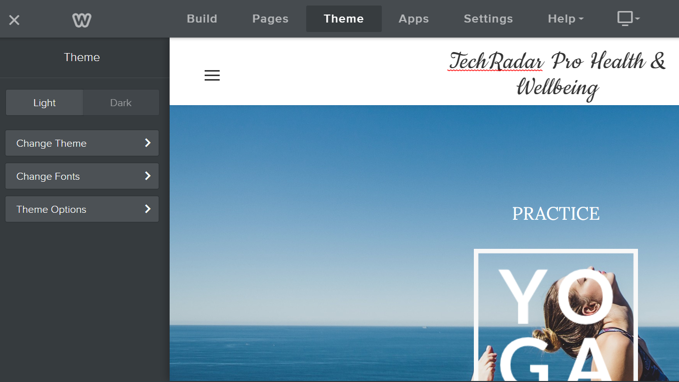
A website color scheme is a set of colors used together on a website, which can include the colors of the text, background, links, and other visual elements on the site.
Creating a color scheme for your website can help create a certain mood or feel for your site. It can also make it easier for visitors to navigate and understand your content. When choosing colors for your website, consider both the aesthetic appeal and the functional purpose of each color.
For example, you may want to use a bright color to draw attention to a call-to-action button. But if that same color is used too often on the site, it can become overwhelming and difficult to read. It's essential to find a balance between using visually appealing colors and colors that serve a purpose. A well-designed color scheme can help improve the user experience on your website. There are many factors to consider when choosing colors for your website.
6 tips for picking the best website color scheme
No matter what website you're building, a suitable color scheme can make a huge difference in how your site is perceived. Note that most top website builder services provide color schemes with templates, which makes the color picking process easier - we list the best website builder providers that offer great color schemes below.
The wrong colors can make it hard to read your content, and cause issues with navigation as well as CTAs (Call to Action). The right colors usually create an inviting and visually appealing experience that encourages visitors to stick around.
When it comes to choosing a color scheme for your website, there are a few things to keep in mind:
1. Consider the tone of your website
Are you trying to create a fun and friendly website? Or a more serious and professional one? The tone of your site will impact the colors you choose. For example, brighter and more saturated colors tend to be more playful, while muted and desaturated colors convey a more serious tone.
2. Consider the colors of your brand
If you already have an established brand, it's important to incorporate those colors into your website. This will help create a consistent visitor experience and make your site more recognizable.
3. Use color to create contrast
You want to ensure that your content is easy to read and that visitors can easily see your navigation and CTAs. To do this, you'll need to create some contrast between the background and foreground colors. A good rule of thumb is to use a light background color with dark text, or vice versa.
4. Use color sparingly
It's tempting to want to use a bunch of different colors on your website, but it's essential to use them sparingly. Too many colors can be overwhelming and make it hard to focus on the most important elements of your site.
5. Stick to a limited color palette
To create a cohesive and visually appealing website, stick to a limited color palette. This doesn't mean you have to use the same colors throughout your site, but you should choose a few core colors and use them throughout.
6. Use color psychology
Specific colors can evoke certain emotions in people. So, when choosing colors for your website, it's important to consider the psychological effects they may have on your visitors. For example, blue is often associated with trustworthiness and dependability, while green is associated with growth and harmony.
By keeping these tips in mind, you'll be well on your way to choosing the perfect color scheme for your website.
Website builders that offer the best templates and color schemes

GoDaddy offers a variety of website templates and color schemes to choose from. They also offer a drag-and-drop builder, making creating a website easy.

This website builder offers lots of color schemes and templates. Jimdo allows you to customize your website's look and feel with its drag-and-drop editor.

Weebly offers a wide variety of templates and color schemes. There are also many customization options available, so you can create a unique website that fits your specific needs and preferences.

Wix also offers various templates and color schemes to choose from. You can also customize your website with their drag-and-drop editor, making it easy to create a unique website that reflects your style.

Squarespace offers a clean and modern design interface with various template designs and color schemes to choose from. Squarespace allows you to customize your website for best user-friendly experience.
How to create a colour palette for a website
Creating a color palette for your website is an integral part of the design process. The colors you choose will have a significant impact on how your site looks and feels, so it is essential to take the time to create a palette that you're happy with.
There are a few different ways to create a colour palette, but one of the simplest is to start with a base colour and then add in accent colors.
To choose your base color, think about the overall feel you want for your site. Are you going for something calming and serene? Bright and cheerful? Once you've decided on the overall tone, choose a base color that reflects that.
For example, if you want a calm and serene feel, you might choose a light blue or green as your base. Once you've chosen your base colour, it's time to add accent colors.
An accent color is a color used in design to highlight a particular area or element. It is usually used to contrast with the main color or colors in a design.
Again, think about the overall feel you're going for and choose accent colours that complement your base. For example, if you've chosen a light blue as your base, you might want to add some darker shades of blue as accents. Or, if you've chosen green as your base, you might want to add in some earthy tones like brown or tan.
Once you have your base and accent colors picked, it's time to start thinking about how to use them on your site. You'll want to create a consistent look throughout, so consider using your colors similarly on different pages. For example, you might use your base color for the background of your site and use your accent colours for headers, links, and other elements. Or, you might use your base colour for your site's background and accent colors for the text.
With a little bit of thought and planning, you can easily create a color palette that's perfect for your website. Just remember to keep the overall feel of your site in mind as you choose your colors, and you'll end up with a palette that looks great.
Importance of a good color scheme for your website
Your website's color scheme is important for several reasons. First, it can help set the mood and tone of your site. A site with a lot of bright, cheerful colors will have a different feel than a site with more subdued or even dark colors.
Second, your color scheme can help improve your site's overall look and feel. If your site's colors are well-coordinated, it will look more professional and put together. On the other hand, if your colors are all over the place, it can give off a chaotic or amateurish vibe.
Finally, your color scheme can impact how easy (or difficult) it is for people to read and navigate your site. If your site's colors are too similar, it can be hard to tell where one element ends, and another begins. On the other hand, if your colors are too contrasting, they cannot be easy to look at for extended periods.
In short, your website's color scheme is important because it can affect how your site looks, feels, and functions. Choose wisely!
What colors work best on websites?
Some colors work better than others when it comes to creating a website that is visually appealing and easy to read. Here are some general guidelines to follow when choosing colors for your website:
- Use light colors for the background and dark colors for the text. This contrast makes it easier for people to read the text on your website.
- Avoid using very bright or very dark colors as they can be hard on the eyes.
- Use complementary colors (colors that are opposite each other on the color wheel) for the background and text. This combination will make the text stand out and be easy to read.
- Use muted colors or pastels for a more calming effect.
- Use warm colors (such as red, orange, and yellow) to create an energetic or exciting feel.
- Use cool colors (such as blue and green) for a more relaxing or calming effect.
Final thoughts
When it comes to choosing colours for your website, there are no hard and fast rules. However, following the general guidelines above will help you create a color scheme that is both visually appealing and easy to read.
Experiment with different combinations of colors until you find one that you like. And don't be afraid to ask for feedback from family and friends to get their opinion on your website's color scheme. With a bit of thought and planning, you can easily create a color scheme perfect for your website.
- Your website will need a top quality web hosting service to ensure your site is secure online
No comments:
Post a Comment