If you upgraded to Windows 11 and were surprised to see how different the Start menu was, you're not alone. Since its release in October 2021, the latest version of the Taskbar, usually found at the bottom of the desktop screen of every Windows release since Windows 95, has divided its users.
The latest iteration of the taskbar has some confusing design features and updates, including changes to icon pinning. Microsoft acknowledged – and continues to acknowledge – feedback, responding with update releases that in the past, have restored some features. Still, users are expecting faster progress.
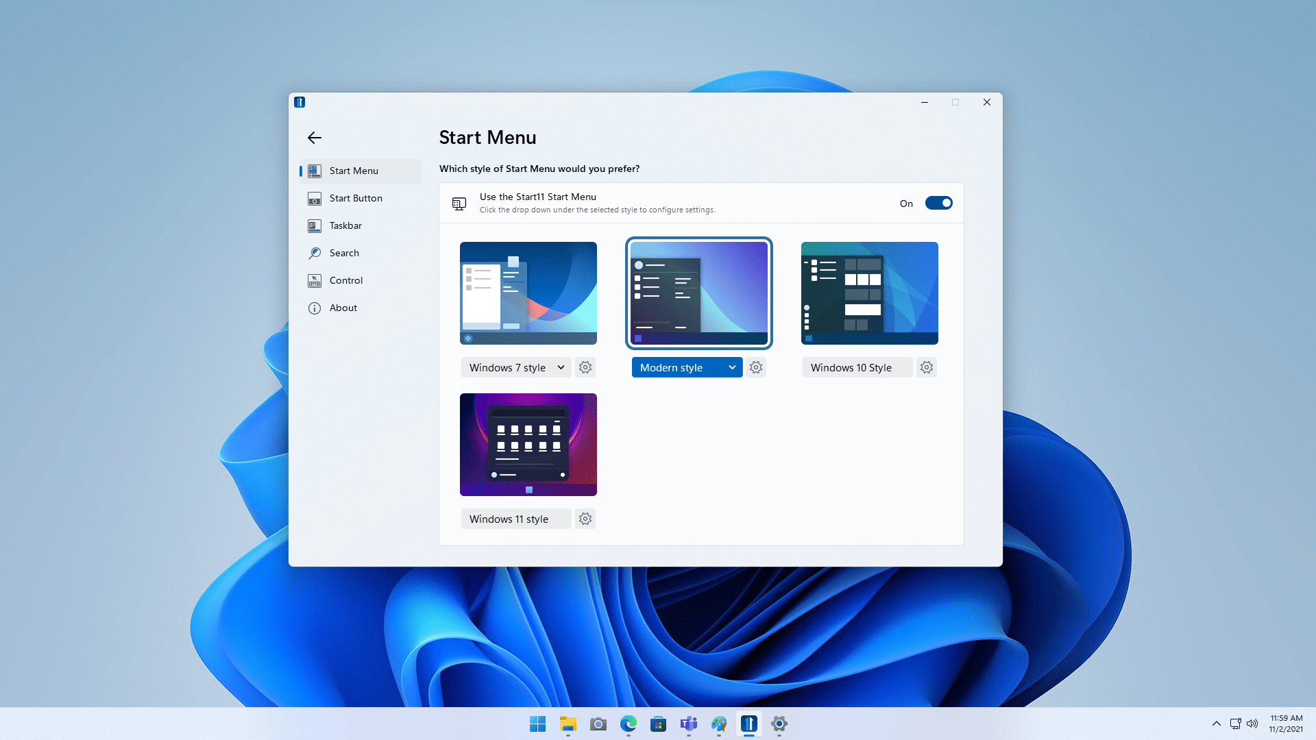
This is where Stardock comes in with Start11, its app to improve the start menu. Start11 incorporates additional features to the menu, including visual changes like reverting the look to a Windows 7 start menu, rearranging the layout, and more.
Understanding what an asset Start11 can be for Windows users, TechRadar spoke to Brad Sams, VP & General Manager at Stardock, about how Start11 came to be, and what the company has in store for the program's future.
It's only just begun for Start11

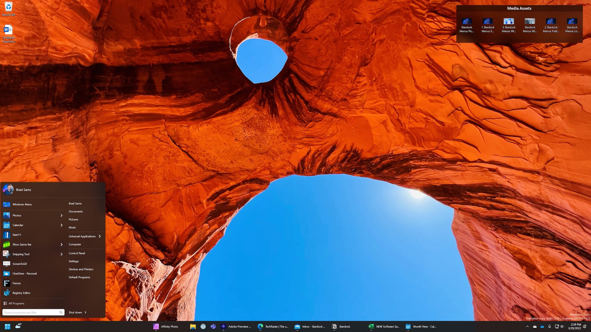
We first asked Sams what his preferred setup was for his Start11 configuration on his PC. "My preferred setup is with the Start button on the far left next to the weather widget, icons centered and ungrouped, in a dark color," Sams reveals. "I have attached an image that shows my layout (see above) so you can see it for yourself!"
Why did Stardock decide to create Start11, especially so soon after the launch of Windows 11? "The StartX line of applications (as we refer to them) started with Windows 8 as a way to return the Start menu to that specific version of Windows after Microsoft removed it," Sams explains. "With Start10, the application allowed users of Windows 10 to reenable a classic Start menu experience with a bit of customization as well."
"With Windows 11, we wanted to bring back a Windows 7-style Start menu and a modern-style menu that fit the ethos of the OS but was designed for a left-aligned placement," Sams continues. "As we've worked more on Start11, we've been focusing less on reenabling classic Windows functionality, and more on allowing our customers to completely customize their Windows 11 Start experience.
Sams told us that because Windows 11 was released with an entirely new Start menu design, the company wanted to add value to it, and was able to do so by allowing the user to tweak the layout.
"With Start11, you can remove the 'recent documents' section, add folders, change icon sizes, and a whole bunch more," says Sams. "Our newest update for the app brings ungrouping back to the taskbar, which is ultimately going to accomplish our main goal: making Windows 11 more personal and productive for our users."

We've been focusing less on reenabling classic Windows functionality and more on allowing our customers to completely customize their Windows 11 Start experience.
Brad Sams
The Start menu in Windows 11 got a mixed reception when it was first released. We're now approaching a year since Windows 11 was first announced in June 2021, and that reception hasn't changed. We wondered what Sams first thought of the revised Start menu. "I will always applaud Microsoft for trying new designs with Windows; it’s not easy to design software that works for 1+ billion people."
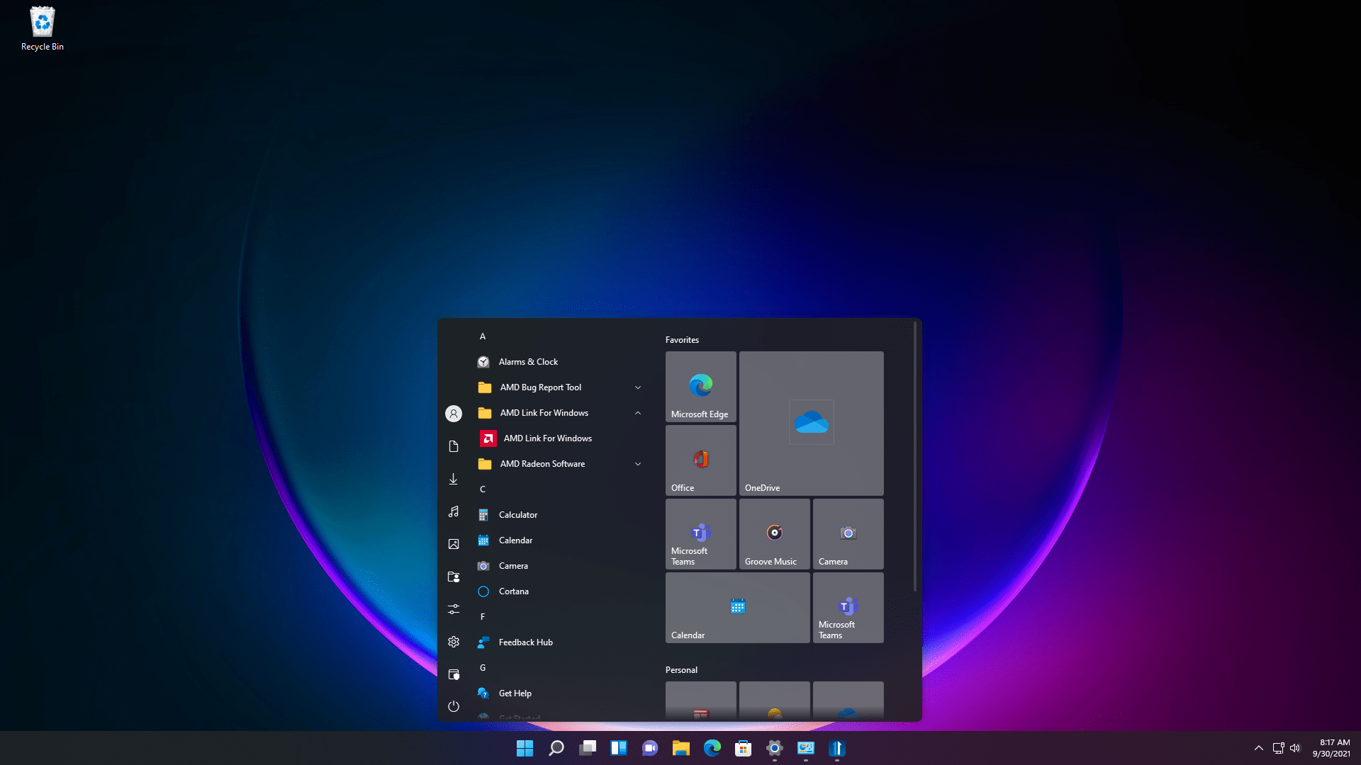
"It’s clear that the company wanted something fresh and familiar, which is why the included Start menu is centered but also feels a lot like an app launcher from a mobile OS," continues Sams. "I don’t think that the design is inherently bad, but what it lacks is flexibility.
Windows 11 is rigid in its layout and doesn’t allow the user to create an experience that matches their workflow," Sams elaborates. "Instead, it forces you to fit their mold. As an example, while you can left-align your Start menu, it feels out of place because it’s designed for a centered experience. The beauty of Start11 is that if you don’t like certain features (like the search bar being at the top), you can change that."
We are in the process of evaluating ideas that make sense for our power users, but have nothing to announce currently.
Brad Sams
There was a recent blogpost from Stardock about almost breaking a component in Windows 11 when trying to bring in a new feature. We wanted to know if Sams and the team had experienced any challenges in developing Start11. "When we were building the ungrouping experience that we are shipping with Start 11 v1.2, we had two options: reenable the Windows 10 taskbar experience in Windows 11, or rebuild a new taskbar in-house," Sams explains.
"The quick and easy way is to simply flip a few registry keys, do a little memory patching, and actually reenable the native Windows 10 taskbar in Windows 11. The problem is that if Microsoft decides to pull any of these assets from the OS, the experience will break, and that’s not a scenario we can support."
"Many of our corporate customers use our StartX apps because it allows them to keep a static experience across every device despite what Microsoft releases with each OS update," Sams continues. "To make sure we hold true to this principle, we had to build a new taskbar in-house to be able to support our features for the life of the OS."

With Start11 constantly being updated, Sams was tight-lipped about what users could expect to see in future updates. "This is where the fun begins. Now that we have an in-house taskbar, the door to add new features to it is wide open," Sams reveals. "We are in the process of evaluating ideas that make sense for our power users, but have nothing to announce currently."
Finally, some of us on the team remember using ObjectDock, Stardock's app that would bring the Dock of macOS to Windows. As Start11 enables start menus from previous Windows releases, we wondered if ObjectDock could appear on the app in the future. "ObjectDock is a Stardock classic and was the first app I ever used from the company. In fact, it’s how I got connected to the CEO of Stardock, Brad Wardell, many years ago. That connection eventually led to me joining the company to lead the software team."
Sams continues: "We have discussed updating the app internally, but currently our objectives are focused on making sure that many of our apps are refreshed for Windows 11. Unlike previous versions of Windows where Microsoft provided a long runway from announcement to release, Windows 11 was announced in June and shipped in October – considering the breadth of the Object Desktop portfolio, we still have a lot of work to do."
No comments:
Post a Comment