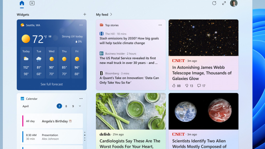
Windows 11 just got a new preview build in the Beta channel that brings in some important changes for widgets, including making the widgets panel a sizeable chunk bigger.
Preview build 22624.1680 introduces what Microsoft is calling an ‘evolved widgets board’, and the main move here is to give the widgets board an extra column of real-estate.
Instead of being two columns wide, it now sprawls over three columns, as long as the device running Windows 11 has a display that can support the additional column. On top of that, there are ‘zones’ to separate the widgets themselves – on the left – and content from the user’s tailored feed (on the right).
Not every tester will see this change to begin with, mind, as it’s rolling out in stages.
On top of this, the preview build also treats folks to animated icons for widgets on the taskbar. These are only working for weather and finance icons right now, and in the former case for example, when rain clouds are displayed, you get a brief animation of the rain falling.
Those are the main changes in this beta release, along with some important fine-tuning of how app defaults work in Windows 11. Specifically, this brings in a new system Microsoft has previously blogged about that employs a Settings deep link URI (uniform resource identifier). This allows software devs to take users straight to the right place in Settings whenever an app wants to be made the default for any given file format (we discuss this further here – note that app pinning hasn’t arrived yet, though).
The full list of work contained in build 22624 is available in Microsoft’s blog post introducing the preview build, as ever, so check that out if you want to see all the nitty gritty details.

Analysis: Microsoft is proceeding cautiously with this one
The larger widgets board was seen in testing last month (in the Canary channel), so it seems that Microsoft is signalling its intention to move forward with the bigger three-column panel, given it has now progressed to the Beta channel.
Clearly, you get more space for content here which is, on the face of it, a welcome move for those who use widgets in Windows 11. Sadly, the widgets themselves take up one column, and the feed content takes up the two columns on the right, so the expansion is putting more emphasis on the news feed side of the equation.
As Microsoft puts it, you might want a “high-value break with your personalized feed”, but rather, you may prefer to see more widgets. Maybe Microsoft will tweak the balance of these different zones, as it calls them, going forward.
This is a change Microsoft is clearly a bit tentative about, because as noted above, the rollout is only happening for a limited number of testers in the Beta channel to begin with. The idea is to keep an eye on feedback and “see how it lands before pushing it out to everyone”, which is Microsoft’s standard approach when it’s not so sure on a feature, or whether it might rub some people up the wrong way.
As well as this bigger panel and animated icons for widgets – those look pretty nifty, we reckon – Microsoft could have another major change in the pipeline, too. Rumor has it that Windows 11 could eventually see the ability to drag widgets onto the desktop, should you wish to do so.
No comments:
Post a Comment