Since Twitter CEO Elon Musk took over the social media platform, users have been flocking to alternatives such as Mastodon to see if they could be suitable replacements for Twitter.
Users have been moving away for a variety of reasons, such as Twitter's subscription service Blue being made available for $8 / £7 / AU$9 and offering Blue Ticks to subscribers, before hastily being taken away after a few days, and an increasing number of bugs plaguing users, such as the app crashing, and images refusing to load, which I've been experiencing lately.
Hive has recently been touted as another alternative, looking like a cleaner version of Mastodon's official app, and it comes with some nice additional features, such as the ability to add music to your profile. Yet there's something about Mastodon's community that keeps pulling me back to that social media platform and trying out the different third-party apps that developers have been working on to make it more user friendly.
However, while Mastodon is more welcoming to new users, there are still three features it quickly needs to do in order to be the successor to Twitter, before another platform like Hive overtakes it.
1. Redesign and rename 'Servers'

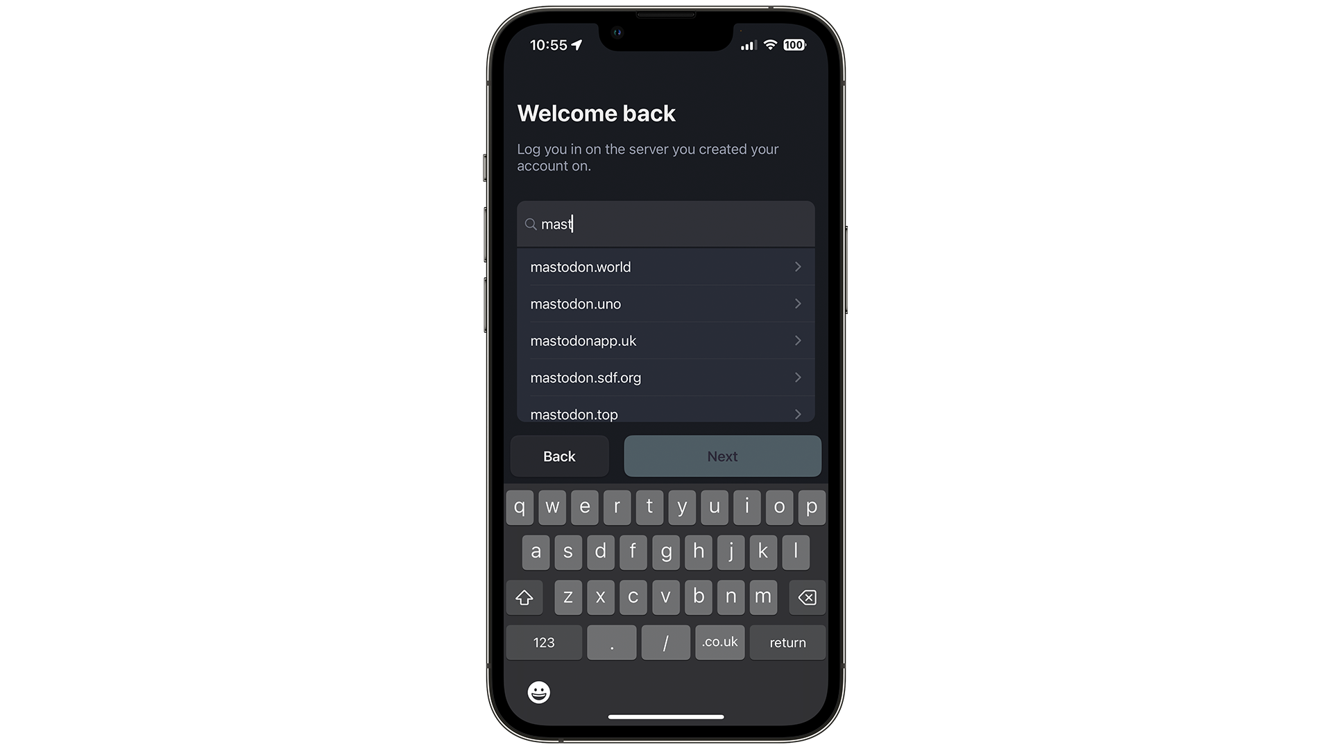
While it's become easier to log in and sign up to a Mastodon server, by using the term 'Server', Mastodon is in danger of alienating a bunch of new users, as it may sound too 'techy' or complex.
Instead, the team could name it 'Communities' and perhaps have new users automatically join one so they can try out the service. The feed in this 'Community' could then show new accounts how to use Mastodon, while also allowing existing users to share tips and advice with newcomers.
Users want to connect to each other without much effort, and Mastodon still requires a lot of this - and that needs to change quickly.
2. Add some color and shine

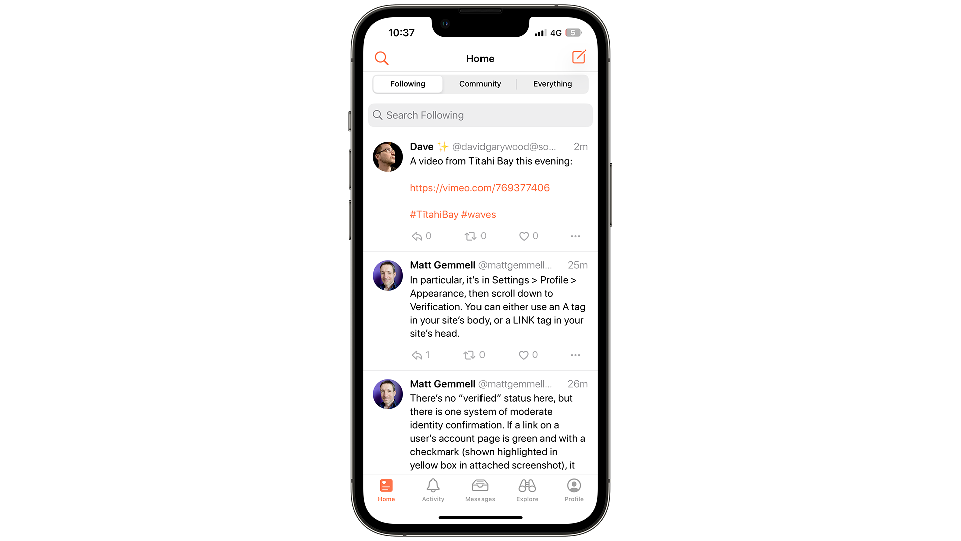
Currently, the design of Mastodon is too sharp, too angular and too dark. If you switch to dark mode in the official app, it's almost a carbon copy of Twitter, especially with the icons.
I want to see ways to customize the user experience in Mastodon by letting users change the fonts and colors, similar to how Bebo, a social platform from 2008, would let you.
This would give Mastodon a lot more personality, as users could design and share their profiles with others. It would also be a nice break from Twitter's rather dull profiles, which all look the same.
3. Make it fun

Not only do we use these apps to keep in contact with family and friends, but it's also to have fun.
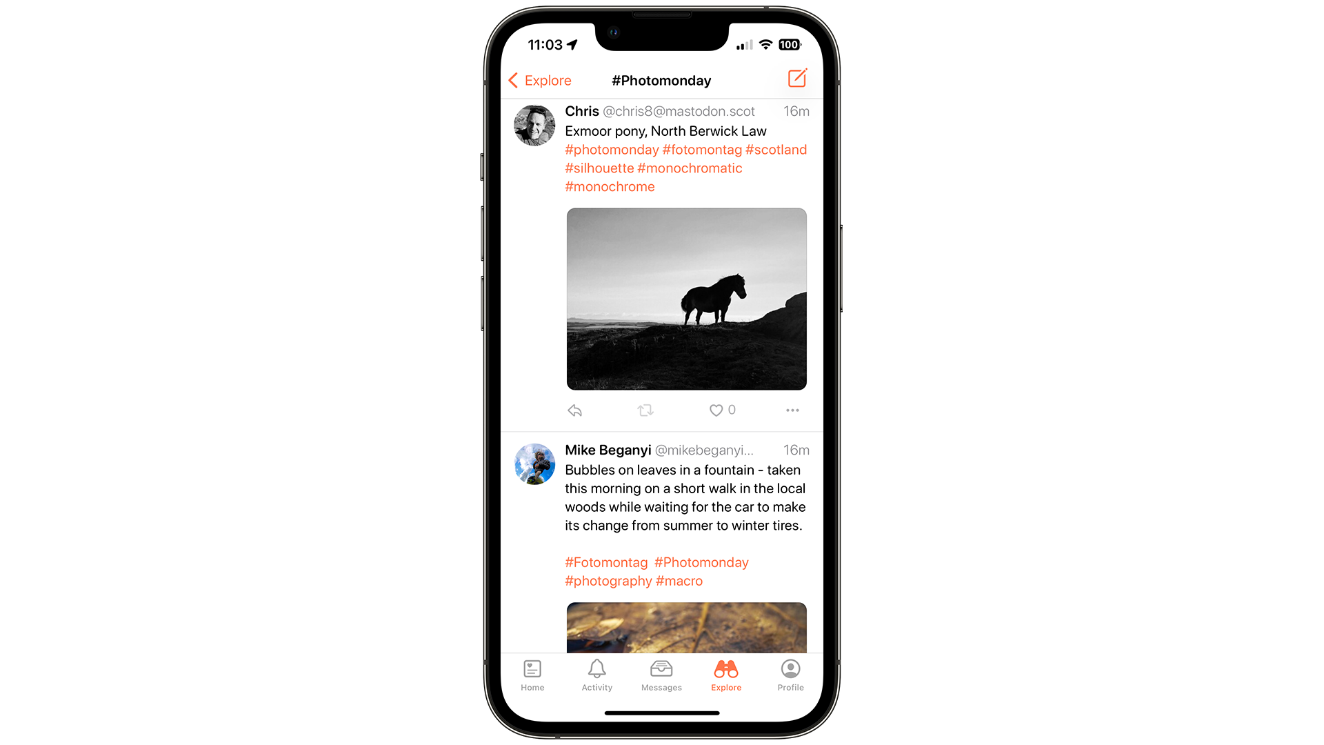
Mastodon lacks this at the moment, and for young people that could be an issue. For example, if images in a post fail to load (which I've noticed has been happening frequently), Mastodon ends up looking rather plain and boring, which could put a lot of people off.
Let's see some new features to better differentiate it from Twitter, Discord and Hive, such as being able to edit posts, or ways to choose different fonts and colors to make what you share really stand out.
Apart from Twitter Spaces, there's not a lot of difference between Twitter and Mastodon once you get past the login screen, and that needs to change to appeal to a bunch of new users who are growing tired of Musk's almost-daily (and increasingly chaotic) announcements on Twitter.
No comments:
Post a Comment