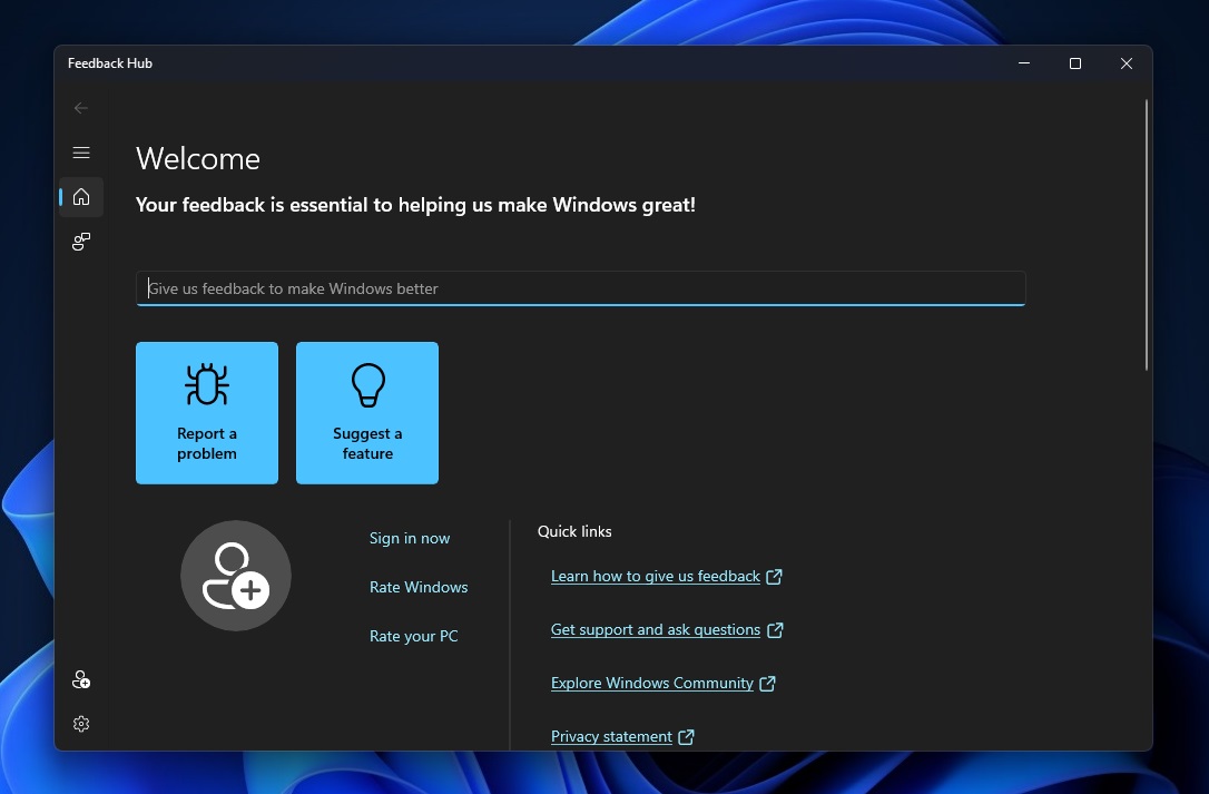
Windows 11 is set to benefit from a bit more visual sparkle as Microsoft is reportedly extending the ‘Mica’ effect to more apps in the OS.
Windows Latest spotted this one, and for the uninitiated, the Mica theme is an opaque effect that’s applied to windows and title bars, so you can see the desktop wallpaper through it. While it’s a fancy translucent effect, the difference is subtle, and as Microsoft explains it “only samples the desktop wallpaper once to create its visualization”.
This means less of a performance hit, and the overall idea is to add some shininess to the desktop environment without bringing any sluggishness along with it, particularly with lesser hardware.
A Reddit user flagged the appearance of Mica in Microsoft Word, and as Windows Latest observes, Mica has just been introduced to the title bar of the Feedback Hub and Tips apps in Windows 11 preview builds (in testing, in other words). The effect is already present in some core Windows 11 apps like Paint, Photos, Calculator, and the Edge browser among others.

Analysis: Mica helps you focus, too
The plan, then, would seem to be the gradual introduction of Mica on a broader basis across Microsoft’s core Windows 11 (and Office) apps. That’s no bad thing, given that you’re getting some extra UI polish without any noticeable impact on performance (hopefully).
Of course, the software giant certainly can’t afford to take any steps which might be detrimental to the speed its new OS runs at during basic desktop operation. Remember that Microsoft is busy banging the drum about how it will improve the performance of core interface elements in Windows 11 next year, and that means solving some of the thorny issues around File Explorer which have been a real frustration for some users.
What’s also worth noting is that Mica isn’t just about looking pretty in terms of its design. Microsoft has made it so that Mica draws focus to the current app being used, because for inactive apps which are open, Windows shifts back to a plain neutral color, providing a clear signal and visual differentiation for the active application.
- Find out where to buy Windows 10
No comments:
Post a Comment