A new Windows release also brings new wallpapers to the fold that set the tone, and the same applies to the newly announced Windows 11.
With a new look, a new focus on the Microsoft Store, alongside the surprising addition of Android apps, there's plenty to like here that certainly justifies the new name.
However, with a refreshed look that seems to bring the best of past Windows releases in their themes and color schemes, one wonders if there's going to be even more refinements as we head into a yearly release schedule for Windows 11.
Before we're able to download the new release however, the plethora of new wallpapers is something to admire, and something that brings hope to the look of Windows as we head into the future.
- Windows 11 is here
- Here are the best laptops of 2021
- Find out where to buy Microsoft Office for the best price
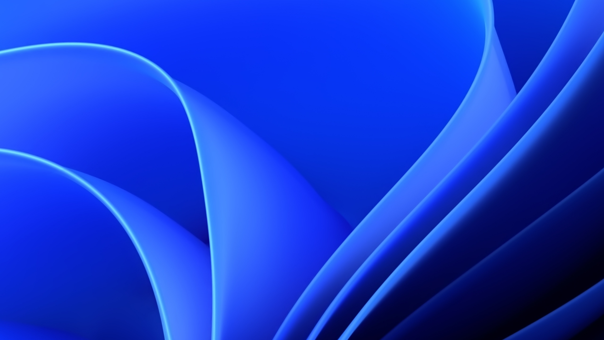
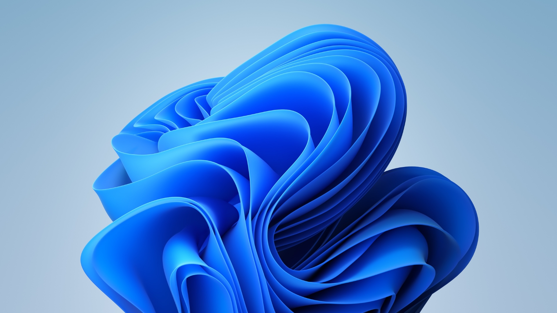
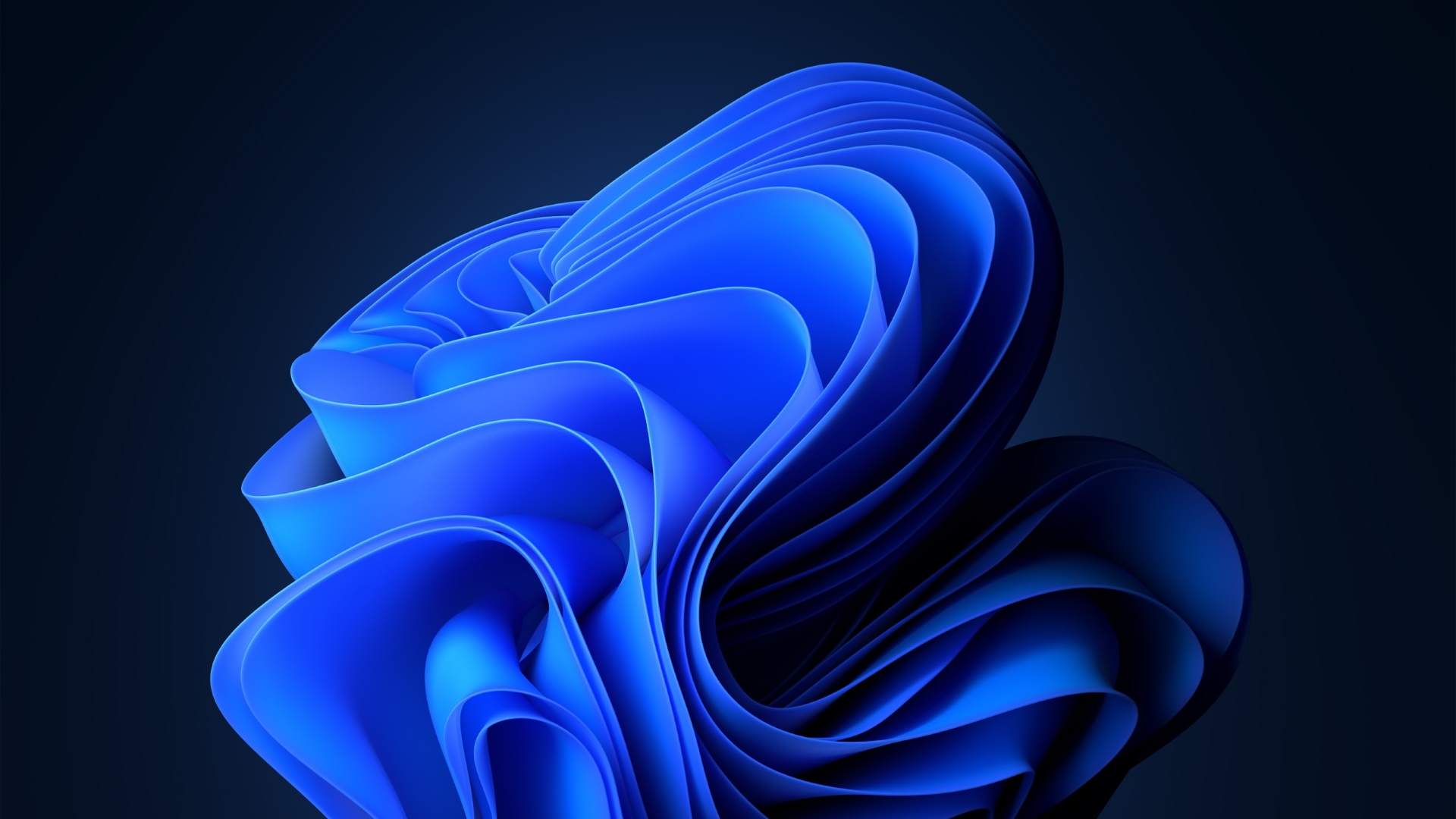
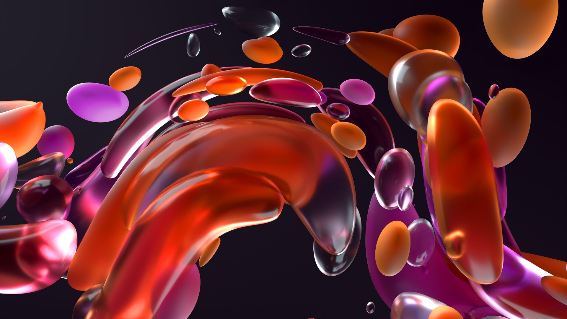
What are the wallpapers?
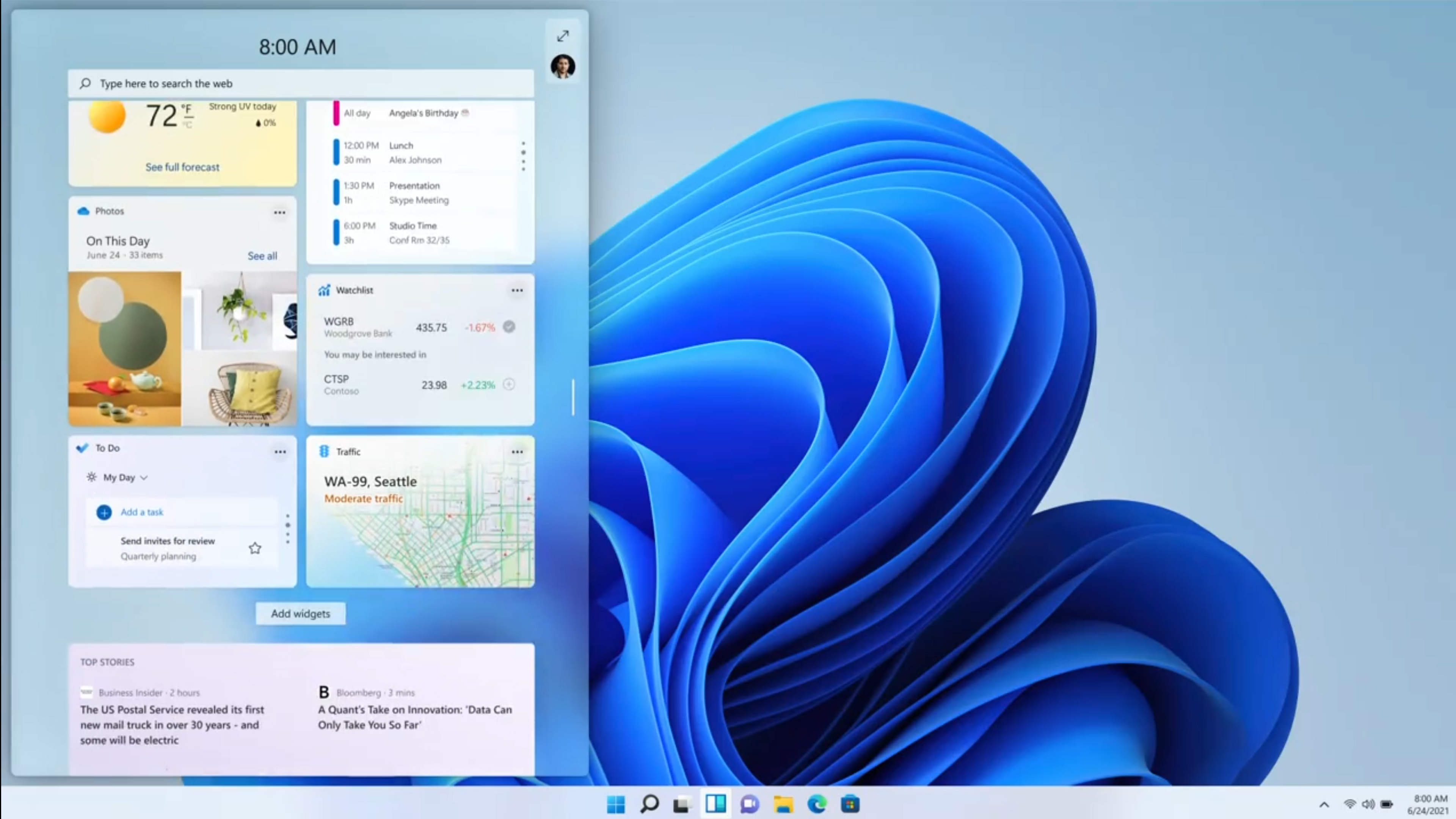
Windows 11 brings a modern take with a user interface that's not seen a huge change since Windows 8.
Similar to Apple's macOS, you have two different wallpapers for each theme when it switches to light or dark mode, better fitting the lighter or darker colors that encompasses the theme.
The wallpapers in this latest release include multiple colors, droplets, sunsets and more to set the tone for your desktop.
Below are just a few of what's coming to Windows 11 when it releases later this year:


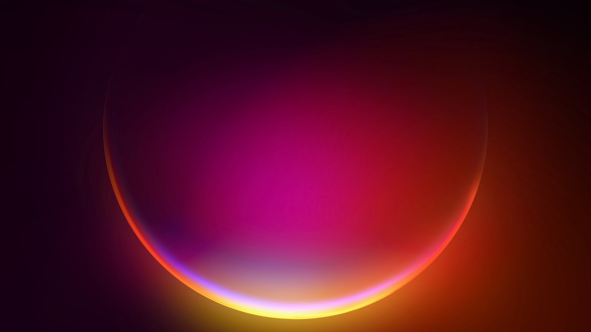
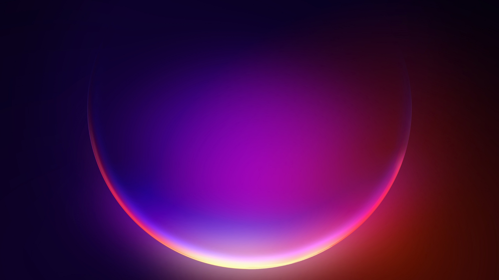
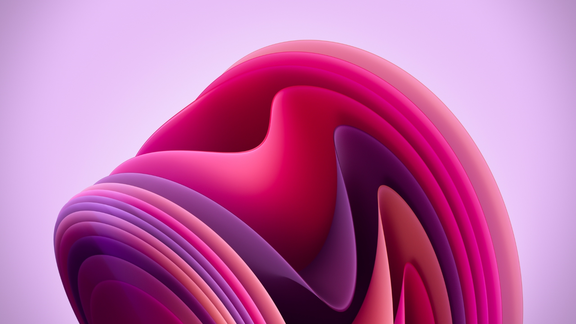
Analysis: Time for a fresh coat of UI
Ever since the debut of Windows 95 where the operating system went fully into the mainstream, with thanks to Jennifer Aniston and Matthew Perry at the height of Friends, we were greeted with a color scheme that came in gray, gray, and some blue.
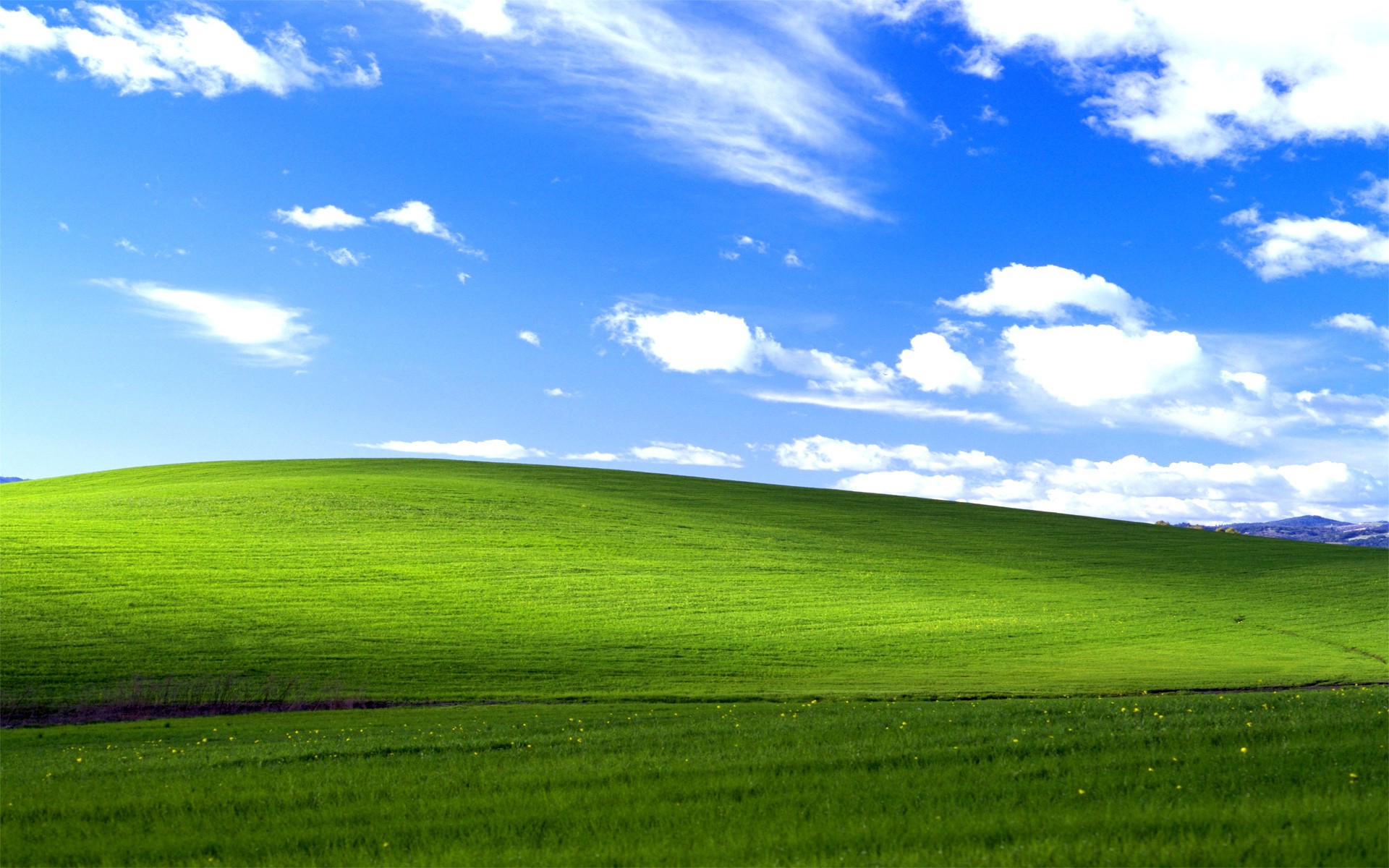
After Windows 98, every update came with refinements in the user interface, but it wasn't until Windows XP in 2001 that we really saw a change in color and layout.
With Windows Vista and its troubled development before its debut in 2006, we were greeted with a new color scheme that also had widgets, or gadgets as they were called, with frosted glass across the windows called Aero.
Fast forward to Windows 11, and we now have a theme that looks like it's taking the best of the past, and combining it all into a modern theme. Even the wallpapers of a sunrise and sunset evoke the iconic wallpaper of Windows XP.
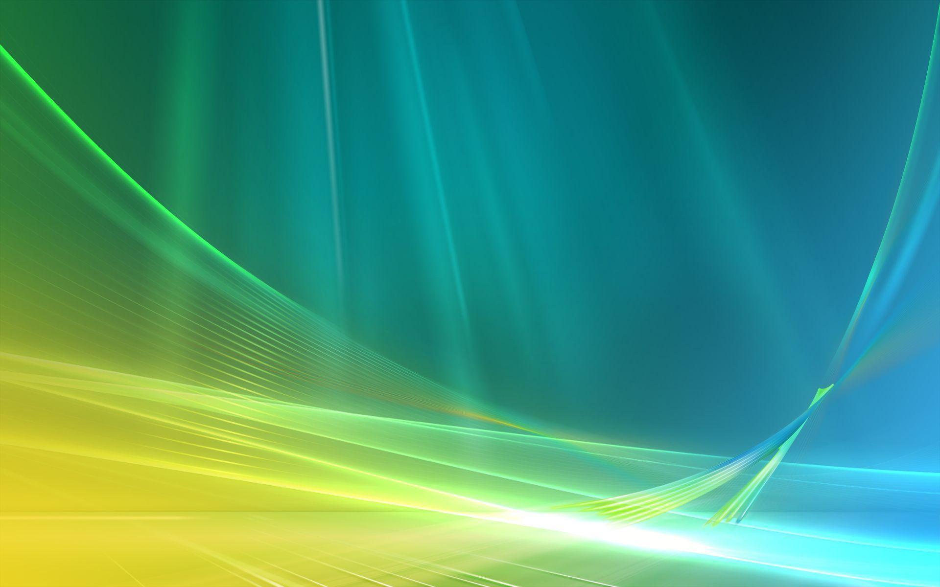
With every release of Windows is a refined theme, even when users aren't clamoring for one, with Windows 8 being the biggest change to Windows so far.
Microsoft received a big shock from their users when the appearance of Windows 8 had a frosty reception. Now that we've been back to the classic desktop and start menu arrangement since Windows 8.1, we're now seeing a further change with the start menu now being called a dock, and being moved to the center of the taskbar.
It looks as though Microsoft is prepared for another change to the look of Windows that users all know, but this time it seems as though it's a change for the better.
Time will tell if we will see further updates to the look of Windows 11 in the upcoming Insider builds, but right now it's a welcome update to a user interface that was starting to become stale.
- TPM & Windows 11 is causing confusion for many users
No comments:
Post a Comment